


Verdict Blocker...left or right?

What a beautiful looking logo, I thought the shape looked familiar!!

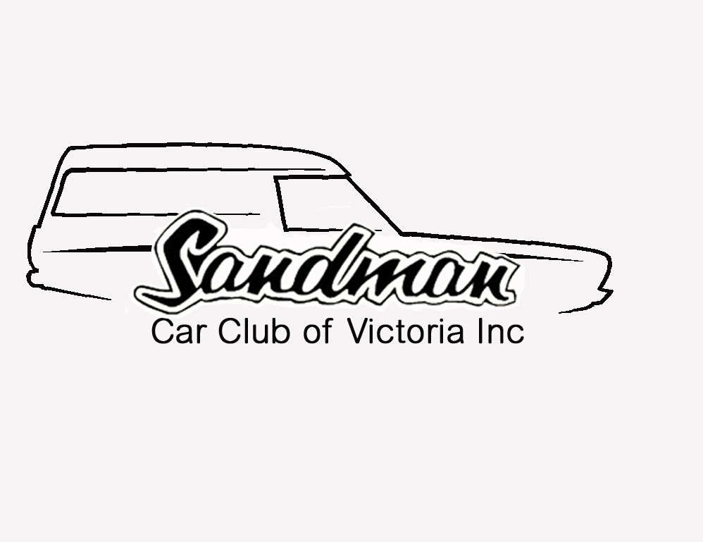
It feels good, it has a modern stroke line but keeps the popular sandman logo and van.
We will get grief from people who will say Sandman came in ute too - so be prepared for that discussion if we settle on this logo.
I have been looking at both left and right images for a while now and I feel the right facing one looks best, however I reckon it's personal choice so we should just vote on it.
I pushed up the Sandman logo a little to tighten the appearance without squashing it. Please let me know what you think.
I know the idea is to have a National organisation but each State has different laws and regulations. As Ivan and I have discussed it's probably best to have the Victorian branch the primary club until we can roll out other State clubs under the one banner.
Last edited by Blocker; 17-03-2015 at 12:07 PM.

That looks great, it's the best logo I have seen out of the ones i see going to the car shows.Originally Posted by Blocker

Great work Ivan

I agree. Looks great!
Really cool you guys are happy with it. From an outside perspective I think it looks professional and not dated. Although a few years from now I'll probably think wtf is that??
Blocker... I was just about to do what you just did, it needed tightening up and you got it spot on
Those colours I think are pretty spot on too.
Ute guys arent gonna love it, but you can't please all the people all the time. Majority rules in this case I guess.
Bill.... I did pay attention to other club logos over the weekend just past.... And you're right, this is up there for sure.
Hainzy.....chuffed you dig it mate.
We'll have much to be proud off if we keep working as a team with the club..... Dont stop now guys.... Still much to do and thanks for everyone's input and help.... Y'all stand up guys
Last edited by Alien DNA; 17-03-2015 at 05:22 PM.
Did you really think i wouldnt do a HQ?
Yes i'll tweak it untill its right...even if its for my own satisfaction

Great job Ivan, I really like it. I knew that a Q would have been on the way.
Yeah the ute dudes won't be happy, nor will the Q dudes, and maybe the J dudes (wrong decal) and probably the future VF dudes.
The orientation of the van is an interesting one. As a stand alone I reckon the right facing looks best. Having said that, I reckon that it's going to depend on what it's on and where it's placed. Having watched quite a few of the ink master series (kids and missus like it) I reckon the tattoo rule was to have things facing inward. For example an animal or head should face on the left of right side of your body should face the toward the middle. On a polo or tee the logos are generally on the on the left(your left as your wearing it) which would means under that theory a left facing van logo (as your looking at it front on like above) would be the correct way. Similarly I reckon on a letterhead if you had the logo on the left or right top, it would look best facing toward the centre.
Probably not a big deal but just a minor observation.
There are currently 1 users browsing this thread. (0 members and 1 guests)
 Posting Permissions


 Reply With Quote


Bookmarks